
Redesigning the Mobile Experience
How do we create a better mobile experience for our users?
This was a two month project where I redesigned the mobile experience for FlooringStores. The team consisted of myself, a product manager, and 5 engineers. This case study focuses on the store front portion of the mobile design.
The problem
The company had just launched a brand new platform that connects shoppers looking for new floors with local mom & pop shops. The first product launch was aimed at giving a great introduction to the store front - who they are, what services they offer, and their products. The design was focused on research done with the store owners in mind, and not the customers. Hence, it was difficult for customers to navigate the site.
The site was very confusing, and I kept getting lost with each click.
Previously, the design put detailed information about the store on the top of the page, the most prime real estate.

The goal on this page seems like it is to register or to call, neither of which is what the user wants.
The main question we wanted to answer was: What are the most used mobile features for consumers?
This will drive the direction of the entire design.
Initial Explorations & Research
I had a month to explore various research directions in order to find the most commonly used features on mobile. I started by creating a detailed research document to present to the team, which included three different directions to collect user interviews. I kicked off the project by interviewing 5 customers and 3 store owners. I asked questions such as: How do you typically search for flooring stores? What is the most popular feature you use? What is the user flow? Here are some high level findings:
Users mainly use the mobile to find directions. Which platform did they use for this? Google directions? Yelp?
Users are looking for store hours. What are the busiest times? How do we make this more prominent?
Store owners mentioned that customers are coming in for estimates, prices, and measuring. Is this something that can be displayed? How many stores do they go to per day? How much variation are there in terms of pricing?
I conducted both in-person and zoom interviews
We learned that customers already come in knowing what style of floors they want, and typically visit the stores right after work. They want to make sure they know the store location, as well as if the store is open after work. I sketched together a wireframe to present to the team of how to display the most desired items.

I removed the login and registration button bc users wouldn’t use this here. Per executive request, we had to leave the ‘free consultation’ button.
I also explored different ways to display the information. One request was to personalize the store front a bit more in order to appeal to the owners and entice them to sign up for the monthly subscription. We eventually scraped this idea because our priority was designing for our customer’s needs.
Narrowing the Scope
Typically we would prioritize and test each feature individually. However, because the first launch failed, we decided to launch multiple features simultaneously to see how it would perform overall. We showed these designs to 5 customers and ranked the effectiveness by asking them a series of behavioral questions.
We asked questions like, “What time does the store open? How do you get there from here?” To measure success, we needed users to:
Complete 4/5 for each of the tasks given
Within 10 seconds
We had the team agree on the metrics beforehand to make this process smooth.
We went through 2 more rounds of designs before we had one that completed both measures of success.
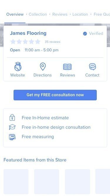
Feedback
Our team of engineers began to build the new mobile page. We then collected a user group of 20 customers to collect feedback each week. This is the 1st version:

It’s very plain - the idea was to test it a few more times before working on any type of branding.
7 out of 20 customers responded to the forms. Majority of the customers enjoyed this new design because they can easily see the information that they wanted. To summarize their feedback:
I like that I can see whether it’s open/closed before I get there.
I like that I know how far it is from my place.
I like that I can read reviews so I know which one to check out first.
I don’t like how long it is. I’m not reading through this entire page.
Based on their feedback, I changed the position of the directions and contact for easier right thumb access. I also added a sticky button so customers can avoid the long scroll.
What We Shipped
After an additional round of feedback and many more surveys and interviews, we launched our final design.

The key different was adding a fixed CTA.
What’s Next?
We want to continue testing this design over the long term. As we gain more insight, we can create better tools and interactions for each of these features.