Conversion Rate Optimization
Redesigning Empire Flippers (500 Inc.) lead generation funnel to increase conversions.
Empire Flipper’s is an Inc. 500 marketplace with over 11,000 members. They facilitate the buy and sell of profitable and vetted online businesses.
The problem
The valuation tool had been used to sell $47 million dollars worth of businesses, despite it being long and outdated.
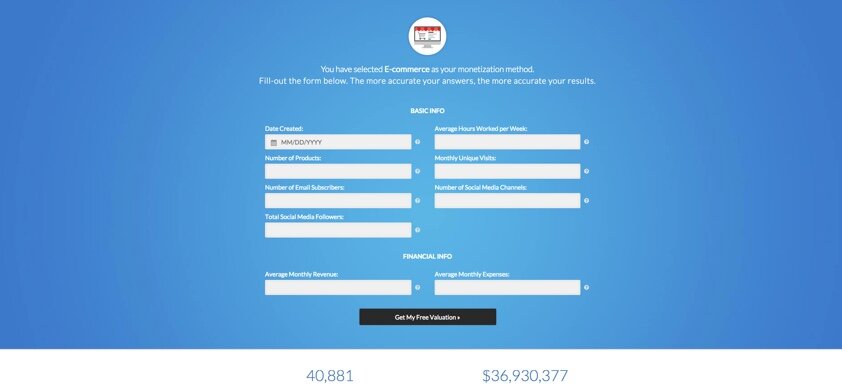
This gave us an opportunity to make changes to the design. Below are a few screenshots of the old funnel.
Having 9 input fields as the first thing users see will mostly lead to a large drop off point here.
Goal
I was given the task to give it a complete overhaul, with the key being to make the user think as little as possible. These are solutions that I came up with:
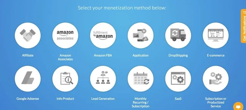
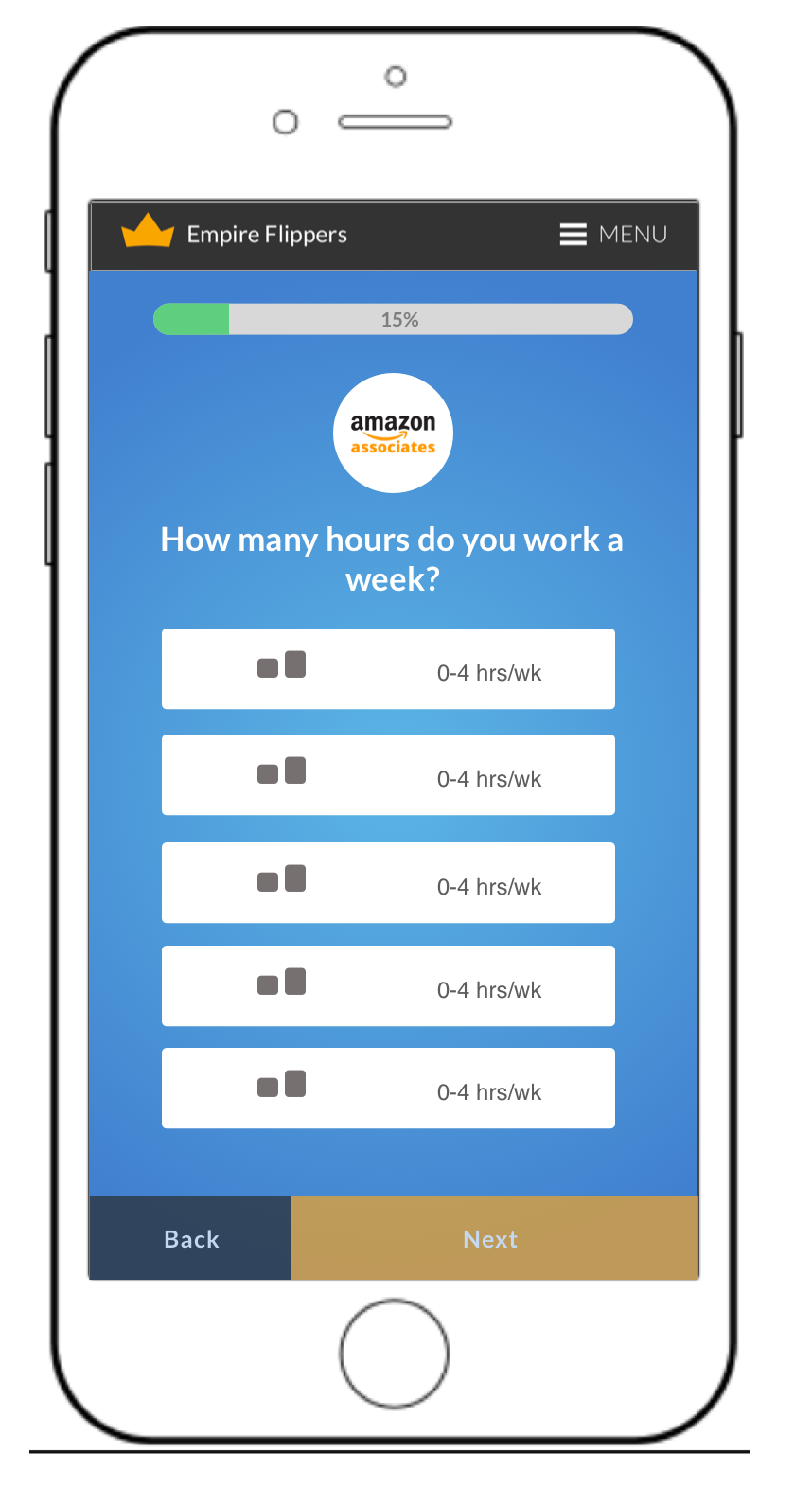
Multiple choice questions. I asked leadership what questions required specific input data and which ones we can change to multiple choice.
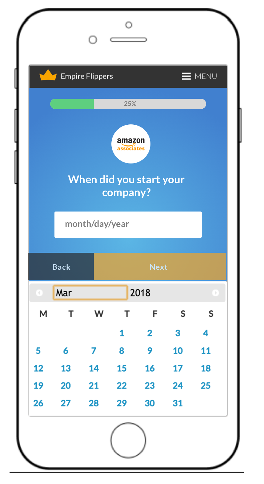
Sliders vs specific input data. We didn’t want business owners to go searching for their monthly income or expenses. That tends to be where high drop off occurs.
Progress visualization. I placed the least favorite questions towards the end. This way, users have already invested effort, and will more likely work towards the finish line.
Testing this famous user psychology theory was super fun!
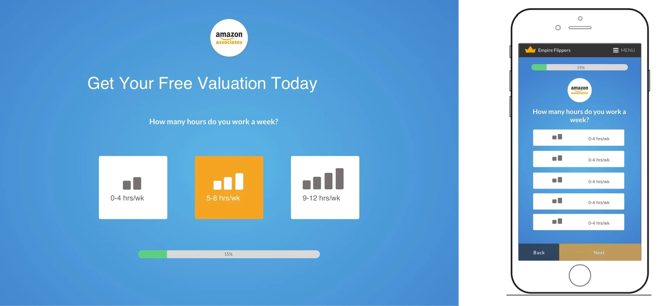
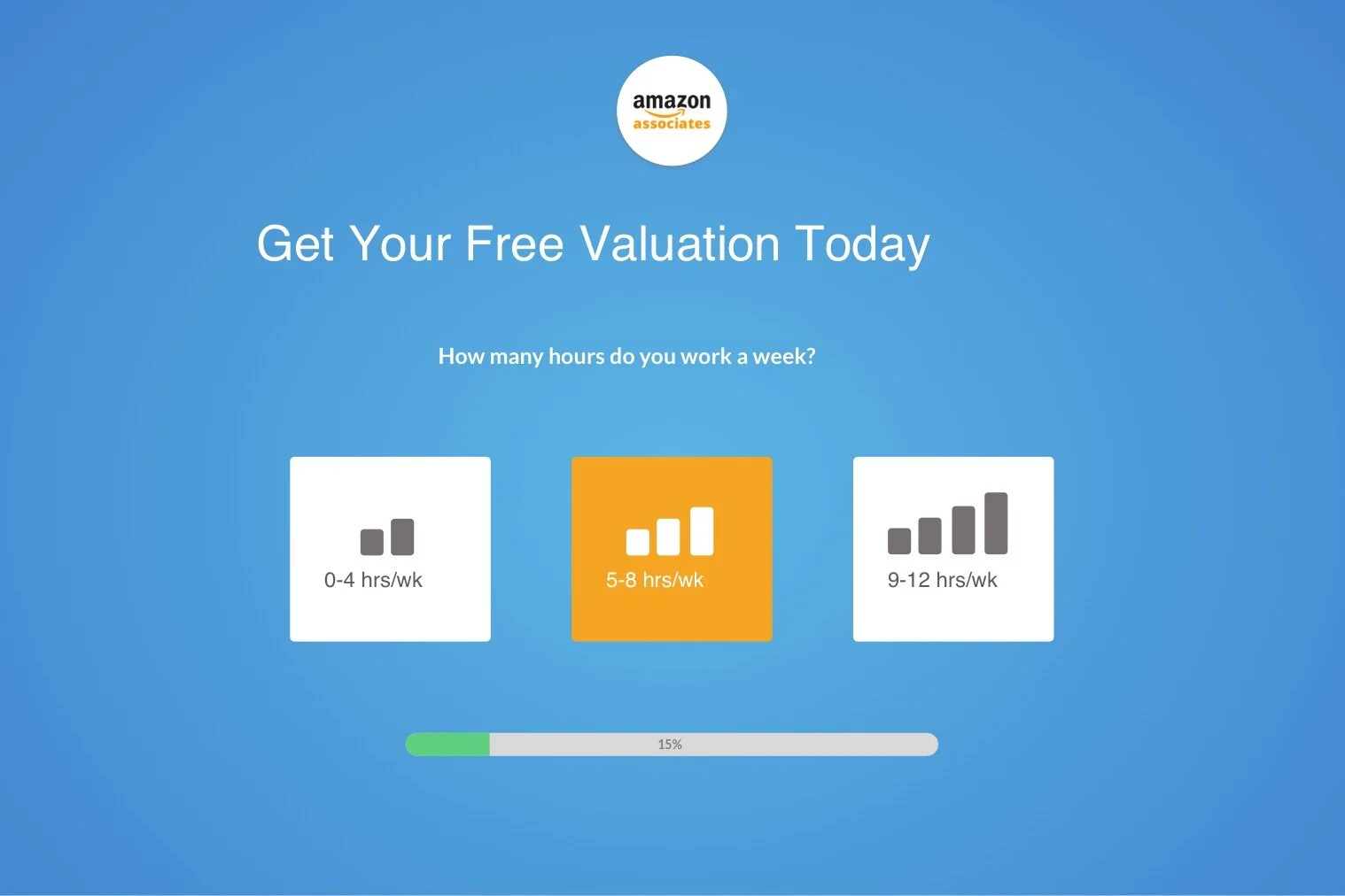
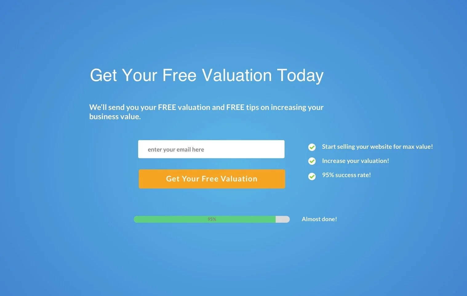
Below are what the first iterations of the new submission form looks like.
Notice how re removed the ‘previous/next’ buttons.
We added encouragement checkmarks towards the finish line for questions that were.
Split Tests
We ran a split test over the next couple weeks. In just two weeks, there was an increase of 40%. From this data, we rolled out the new design site wide.
Mobile Optimization
Since we had an increase in conversions for desktop, we tackled the mobile next.
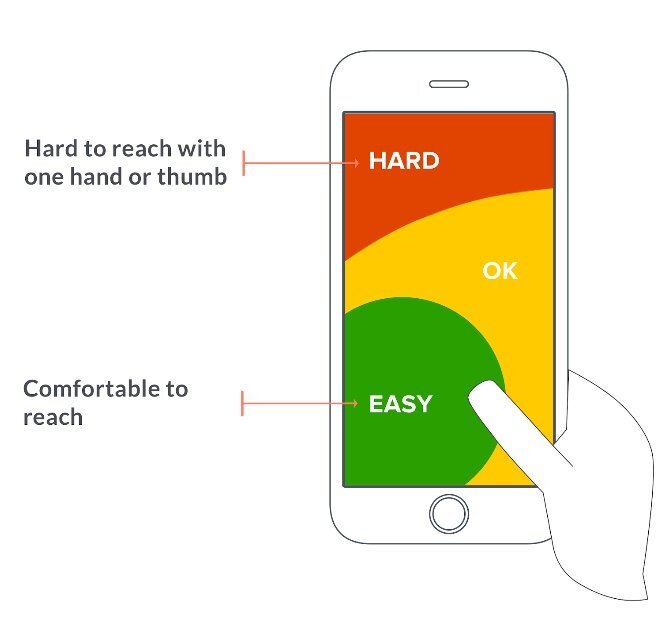
We used a software called Formisimo to identify bottlenecks in the funnel. From the data, we realized that there were certain questions that made the thumb difficult to reach. So I redesigned the layout to make sure that all questions were comfortable within reach.
We used the successful design of the web as a baseline for mobile.
How often do you struggle with buttons on top corners?
What We Shipped
We redesigned the buttons so that they lined up vertically instead of horizontal, making every button within the ‘easy-to-reach’ zone.
Results
This increased mobile conversions by 10%! In just 47 days, we had a 51.6%.
What’s Next?
We continually monitor the results over the next few months to see where along the funnel we can optimize the design.
