
The Career Connect app is designed to help users save time and boost their job search by finding reliable recruiter contacts and automatically generating personalized messages, ready to send with just one click.
Outreach, but make it fun.
For an eternity, the job application process has remained unchanged. Send hundreds of applications and hope they don’t vanish into the void. Pathrise flipped the script—helping people apply 3x faster and land jobs with 2x the compensation. But success has its quirks. In 5 years, Pathrise had tripled its students, but the app was struggling to keep up. It became the tech equivalent of an overstuffed filing cabinet—slow, clunky, and unable to adapt to the growing demands of the modern job hunt.
Tasked with redesigning the outreach experience, I joined the team to make recruiter outreach not just better but smarter, faster, and dare I say, enjoyable.
Humble Beginnings
In just five years, Pathrise grew from two friends helping peers land jobs in their bedroom to a powerhouse that helped over 2,000 individuals secure careers in tech. By 2022, Pathrise supported more than 500 students, achieving an average salary increase of 50%.
However, scaling brought its own challenges. Users and mentors struggled with disjointed workflows, relying on a hodgepodge of tools like Gmail, Google Docs, Salesforce, and other apps. Like trying to build a rocketship with duct tape and hopes, if you will. This fragmented system led to inefficiencies, lack of cohesion, and user dissatisfaction. As app performance issues multiplied, the platform failed to reflect the needs of its users, complicating their job search journeys. The biggest roadblock for our users wasn’t just finding jobs—it was staying motivated week after week to complete their tasks.
“The biggest roadblock for our users wasn’t finding jobs - it was staying motivated week after week.
Our north star was clear: create a strong foundation to automate the tedious parts of the job search while keeping users engaged.
Our high-level goals were to:
(1) Make the platform fast, easy, and intuitive for all users. (2) Give users more time back by automating repetitive tasks. (3) Build a system that drives deeper engagement through actionable analytics.
My Role
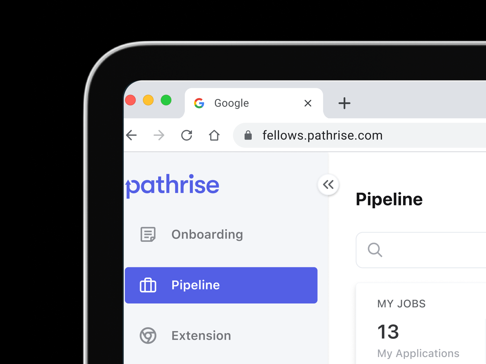
In November 2023, I led the design of Career Connect, with our Product-Led Growth (PLG) launch planned for March 2024. I collaborated closely with a Product Manager, four Engineers, and the Head of Growth to redefine the outreach experience.
The Problem
At the start of the project, there was little alignment on the core issues or goals. Users were struggling to complete their job tasks, but why? What motivated—or discouraged—them? What’s holding them back?
Partnering with the product manager, I set out to uncover key insights through interviews and data analysis. We spoke with 10 users who were wrestling to hit their weekly targets and 6 of their mentors. Our mission? To uncover the real hurdles they faced and the downright scrappy workarounds they’d come up with. Here’s what we found:
Limited time to work on the job search. Users struggled to find 1-3 hours per day on their job search. They expected arduous tasks like resume, and outreach to be done for them.
Frustration from lack of results. Weekly goals—10 applications and 5 outreaches—yielded minimal progress, leading to frustration. Users expected smarter solutions from the platform
Ambiguous task expectations. Tasks varied week-to-week with no clear guidance, creating confusion and inefficiency.
Time-Consuming, Repetitive Work. Long applications, tailored cover letters, and outreach messages consumed more time than anticipated.
Smarter. Not harder.
The findings confirmed a critical truth: users wanted the platform to make their job searches smarter, not harder. With generative AI technologies like ChatGPT emerging, we saw an opportunity to enhance outreach processes dramatically.
If job seekers with ample free time struggled, how much harder was it for those juggling full-time jobs, family responsibilities, or school? We realized that asking users to spend hours on outreach was about as helpful as giving them a spoon to dig a swimming pool. The solution had to do more than streamline tasks—it had to rethink the process entirely.
Rinse. Write. Repeat.
Data analysis and user interviews highlighted significant pain points in the outreach process. Nearly all workflows involved extra effort, like hunting down recruiters on LinkedIn and crafting semi-personalized messages—hardly the seamless experience users anticipated.
A Financial Drain
The inefficiencies extended beyond user frustration, costing the company over $150,000 monthly due to fellows failing to send outreach messages. Mentors were forced to expend considerable time and energy reminding users about their tasks, impacting business resources. Each additional month a student stayed in the program, caused by incomplete outreach, contributed to this financial strain.
Personal factors such as health and full-time jobs further constrained available hours.
Shifting Expectations. Weekly changes in goals and priorities left users unsure of what to focus on, causing delays and confusion.
Ambiguity in Information. The lack of clarity in guidance and instructions further derailed users from forming effective outreach strategies.
App Shortcomings. A confusing and inefficient platform exacerbated these issues, making it harder for students to create coherent outreach plans.
Mentor-Student Alignment. Frequent communication was required to clarify or correct outreach plans, consuming both time and energy while frustrating all parties involved.
Career Connect emerged as the solution to the core outreach challenges—a thoughtfully designed tool to designed to save time, reduce effort, and enhance simplicity.
A Proven Value Ignored. Outreach increased the probability of an interview by 42%. Yet, fellows who skipped outreach tasks remained in the program an average of 5.2 months longer, magnifying costs.
Repetition Without Reward. Users faced the same tedious workload each week—10 applications and 5 outreaches. Customizing each message took over 20 minutes, leading to frustration when results didn’t appear immediately. Progress felt elusive, causing motivation to wane.
Time and Circumstances. Personal factors such as health, family obligations, or full-time jobs further constrained users' available hours, making repetitive tasks even harder to complete.
Perceived Futility. Without tangible results early in the process, users often concluded that their efforts weren’t effective—a morale killer for anyone tackling a job search.
Tedious and Time-Consuming. Filling out long applications, crafting tailored cover letters, and conducting outreach consumed far more time than users expected, especially when repeated endlessly.
This insight solidified the need for a smarter, more efficient system—one that automates repetitive tasks and adapts to user circumstances, giving them back their time and energy.
Reframing the Problem: Aligning Expectations for Effective Outreach
Poorly defined expectations were at the heart of the outreach challenges, triggering a cascade of inefficiencies:
Perfect for everyone.
Three Questions That Shaped the Strategy:
(1) How do you design for students across diverse industries? (2) What contexts need to be accounted for in their journey? (3) What does the perfect outreach experience look like?
To answer these questions, I delved into the various factors influencing the outreach experience. It wasn’t just about solving one problem but understanding the broader context in which students operate.
I developed the Spectrums and Situations Framework, mapping:
Industry Diversity. Tailoring outreach for students from tech to healthcare to creative fields.
User Contexts. Accounting for personal circumstances like time availability, career goals, and resource access.
Ideal Experiences. Identifying the traits of an effective and efficient outreach process.
This framework guided our approach, ensuring that Career Connect catered to the wide range of user needs while striving for simplicity and effectiveness.
A more intuitive design
The existing outreach app was a stopgap—poorly designed to meet the growing and evolving needs of students. To break free from preconceived notions, I introduced the team to a design approach centered on mental models.
Mapping the Experience
I created a detailed map to highlight each outreach stream and its downstream impacts. The map allowed for identifying challenges at every stage, ensuring we invested resources wisely.
Redefining the User Flow
The user flow diagram emphasized the wide range of actions students take while interacting with Career Connect. This comprehensive view shone a light on overlooked touchpoints and helped the team think about every possible pathway students might take.
Breaking Biases
I introduced this reframing to dismantle stereotypes about the student experience. As one teammate noted:
“Historically, Pathrise poorly empathized with the step-by-step student experience.”
By focusing on the granular, step-by-step journey, we aimed to build scalable, flexible design solutions that could adapt to any combination of user actions or needs. This approach ensured Career Connect was not just a tool for today but one that could grow alongside students' evolving journeys.


Automate and do nothing.
To address the inefficiencies in the outreach process, our team adopted a new design philosophy: automate repetitive tasks while empowering users with control where it truly matters. This shift in perspective moved us away from simply “adding AI features” and toward crafting an automation-first experience. This led to four critical design challenges:

Overcoming Outreach Fatigue with Verified Contacts and AI-Generated Content
A significant barrier to consistent outreach was the overwhelming effort required for students to personalize each message.
The process of tailoring messages to connect their resume with a company’s needs became tedious, leading to boredom and burnout. A few key insights from the data:
Outreach consistency: 50% of students sent only five outreach messages per week, far below optimal engagement levels.
Central Design Principles:
Do the heavy lifting: Automate contact searches and message writing to free up students for higher-impact tasks.
Personal factors such as health and full-time jobs further constrained available hours.
The Key to an Optimized Outreach Experience
To truly revolutionize the outreach experience, we honed in on a singular goal: find the right contacts and craft personalized messages effortlessly.
The Breakthrough: AI-Driven Personalization
The team quickly aligned on a solution: leverage AI to automate message generation. This approach wasn’t just feasible—it unlocked a cascade of additional benefits:
Reliable contact insights: Collect data to identify the most effective and responsive recruiters.
Optimize messaging algorithms: Analyze and refine the most-used AI-generated messages for better outcomes.
Enhancing the User Experience
To support these new features, we introduced subtle but impactful UI enhancements:
Loading animations: Instead of displaying blank screens or static loaders, we designed animations to provide feedback as AI curated reliable contacts and generated personalized messages.
Seamless interactions: These animations bridged the gap between action and output, reducing user frustration and reinforcing trust in the system’s capabilities.
By prioritizing automation and thoughtful UX, the redesign didn’t just save time—it fundamentally transformed how students approached outreach, making it smarter, smoother, and far more effective.
Warm up time: Provide users with prepared contacts and messages early, giving relationships a chance to grow before follow-ups.
Maximize input efficiency: Use the data students already provide (e.g., resumes, job preferences) to generate meaningful, relevant outputs effortlessly.
Pain points:
By addressing these pain points, Career Connect transformed outreach from a time-consuming chore into an efficient and empowering experience.
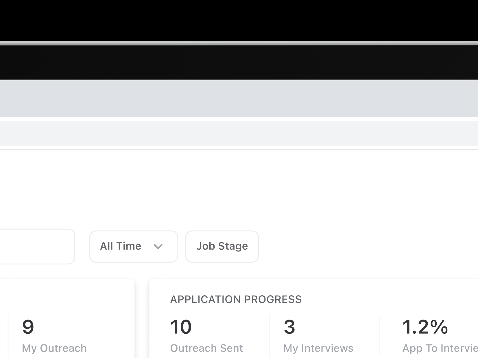
Impact of outreach: Increased interview rates by 42%, underscoring its value in the job search process.
External adoption: Only 35% of Monthly Active Users (MAU) utilized the extension, signaling a need for more accessible, time-saving features.
Proposed Features:
(1) Verified contacts:
Objective: Eliminate the effort of finding the right recruiter or decision-maker.
How it works: Automatically populate a curated list of verified, up-to-date contacts for each company, saving users hours of research each week.
Result: Users could focus on building relationships rather than hunting for email addresses.
(2) AI-Generated content:
Objective: Reduce the burden of crafting personalized messages.
How It Works: Generate outreach messages tailored to the student’s profile, resume, and the company’s values in seconds. Students could edit and approve content instead of starting from scratch.
Result: Consistent, high-quality outreach with minimal user effort.
A new app was born.
INSTANT RECRUITER CONTACTS
Career Connect identifies the most relevant recruiter for each application, saving users hours of research. It automatically helps you find the correct recruiter and company. No more wasting time looking for the right person and email.

GENERATE MESSAGES WITH AI
There’s always a faster, and better way to write outreach messages. Using user profiles and company data, the system creates personalized outreach messages in seconds, so users can spend less time typing and more time celebrating.

AUTOMATED TASK TRACKING
No longer are the days where students had to manually input each outreach sent. Outreach progress is automatically tracked, giving users clear visibility into their weekly goals.
Building confidence.
Introducing a fundamentally different workflow always carries the risk of friction, and our team was keenly aware of this challenge.
Validating New Features
To mitigate concerns, we conducted early prototype testing with six users. The results were overwhelmingly positive:
Unanimous enthusiasm: Every tester expressed excitement about the new features, especially the automation aspects.
“Find Contacts” resonated: This functionality emerged as the standout feature, clearly demonstrating its ability to alleviate frustration and streamline the outreach process. Key take aways:
Automation wasn’t just accepted—it was celebrated. Users appreciated how the new features saved time and effort while maintaining control over the process.
The results solidified our confidence in the redesign and validated that we were moving in the right direction.

Personal factors such as health and full-time jobs further constrained available hours.
Key Design Challenges
Balancing the loading state: The confirmation screen had to present enough information to reassure users without creating unnecessary wait times. However, it was equally important to allocate sufficient time to optimize and display reliable contacts and personalized messages.
Lengthening of the core flow: A riskier design decision was to extend the flow slightly.
This allowed us to frame the new steps as a shortcut to reduce future work, making it feel like an investment rather than an added burden.
The goal was to show users how completing tasks now would save them time and effort later, emphasizing enjoyment and ease.
From automation to manual: In situations where automation could not deliver optimal results, the UI gracefully transitioned users to manual input.
UI Principles
Inspiring confidence: Clear, visually appealing progress indicators were added to show that the system was actively working on behalf of the user.
Messaging emphasized the benefits of the automation, reassuring users about accuracy and quality.
Ease of progression: For users eager to move quickly, the flow offered simple, intuitive paths to proceed without friction.
Framing as a shortcut: Subtle copywriting and visual cues highlighted how the flow simplified their workload, creating a positive association with the extra steps.
This thoughtful approach to the confirmation screen ensured users felt supported, empowered, and eager to engage with the new outreach process.
This phase wasn’t just about testing functionality; it was about ensuring that the solution aligned with user needs and expectations, paving the way for a seamless adoption of Career Connect’s new capabilities.
Confirmation screen
If the new experience was designed to do the heavy lifting for users, the confirmation screen became a crucial moment to establish trust and assurance. Users needed to feel confident that their outreach tasks were effectively handled, and the process was moving forward smoothly.
The launch.

The primary goal of these designs was to emphasize contact accuracy as it resolved, under the assumption that reliability would foster user trust. However, repeated testing revealed that our approach had overestimated the impact of anxiety on user behavior. Here's what we learned:
Tolerance for Loading Time:
Users were surprisingly unconcerned by the loading wheel or the time it took for contacts to resolve. Their focus was more on the results than on the speed of delivery.
Expectations of Low Reliability:
Many users anticipated that the suggested contacts might be unreliable, which shaped their expectations. They were willing to double-check and verify the contacts themselves, reducing the need for perfect accuracy upfront.
Lingering Nervousness About Contact Quality:
While users expressed mild nervousness about contact reliability, it wasn’t as disruptive as initially thought.
Challenges and Stakeholder Feedback
Engineering Limitations
The complexity of dynamically verifying contact reliability in real-time posed technical challenges.
Stakeholder priorities
Feedback emphasized the need to balance trust-building features with simplicity and usability.
profiles and reliability expectations, we built a system that did the heavy lifting when it could—and gracefully stepped aside when it couldn't. This concept of adaptive automation became the cornerstone of our redesign.
Core Principles of the Adaptation Framework
Respect User Control and Agency
Every design decision needed to empower users with choices.
Features were built to allow seamless opt-in, opt-out, or full manual control, ensuring users could always take charge when needed.
Flexibility to Learn and Adapt
The system avoided making rigid assumptions about user preferences or behaviors.
It dynamically adapted based on user actions, learning when to assist and when to step back.
Transparency in Automation
Automation was designed to feel intuitive and trustworthy, with clear signals about what the system was doing and why.
Users needed confidence that the app was working in their best interest, especially when automating key steps.
Pivoting to a Simplified Interface
After the third round of testing, it became clear that the original approach was unnecessarily complex. The designs were revised to focus on what users truly valued:
Simplicity Over Perfection:
A streamlined interface prioritized presenting the best available contact with minimal distractions.
Balanced Trust Signals:
Subtle visual cues (e.g., a confidence badge or a short explanation) conveyed reliability without overwhelming users.
User-Centric Adjustments:
The focus shifted to aligning with user priorities: ease of use, clarity, and enabling their decision-making process.
By simplifying the design and reducing emphasis on reliability metrics, the updated interface better aligned with user needs and improved overall satisfaction. This iterative process highlighted the importance of designing for actual user behavior rather than perceived anxieties.
Giving users back their time
The challenge was clear: users were losing valuable time to repetitive tasks, and our solution needed to optimize their outreach experience while respecting their autonomy. By leveraging insights into contact
The end.
In the five months following the launch of this project, the team continuously refined and enhanced the design, incorporating key features and smarter AI powered by user feedback. Watching the app gain user appreciation and become a beloved tool since its release has been incredibly rewarding.
The revamped Career Connect was met with enthusiastic approval, delivering measurable improvements:
Finally, it’s done.
While the redesign dramatically streamlined the user experience, it also revealed opportunities to encourage more consistent user engagement. The updated system not only addresses immediate challenges but also creates a strong foundation for future innovations and continued success.